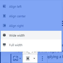
Gutenberg, the new editor from WordPress 5+ comes with some handy block options which allow defining full and wide width.
If you want to keep a fixed centered container, and have at the same time some blocks that extend out of this it on left and right, you’ll need to add some specific CSS classes.
These classes can be enabled by adding the following code in functions.php in your theme.
add_action('after_setup_theme', static function () {
    add_theme_support('align-wide');
});
And these properties when registering the block type:
supports: {
    align: true,
    alignWide: true
}
You can now select the width from block options. See the image below:

If your theme will not add the necessary CSS, there will be no effect between any of these options from this menu. Let’s add the CSS. For convenience, I’ll use SCSS:
$site-width: 1280px; // The site layout size. Adjust to match you theme size
$site-width--wide: $site-width + 300px; // Wide blocks size has an additional 300px

// Add custom properties to HTML document
:root{
    --width-site: #{$site-width};
    --width-site-wide: #{$site-width--wide};
    --side-margin: 20px;
    --scrollbar-width: 0px; // This is change with JS on page load.
}

// Add CSS specific to blocks
.full,
.alignfull {
    position: relative;
    max-width: none;
    width: 100%;
    margin-left: 0;
    margin-right: 0;
}

.wide,
.alignwide {
    max-width: var(--width-site-wide);
    width: 100%;
    margin-left: auto;
    margin-right: auto;
}

// This is the container CSS class name. Change it to fit you theme class.
.site-layout {
    padding-left: var(--side-margin);
    padding-right: var(--side-margin);
    clear: both;

    .alignwide {
        width: auto;
        margin-left: -150px;
        margin-right: -150px;
        max-width: calc(var(--width-site) + 300px);
    }

    .alignfull {
        width: calc(100vw - var(--scrollbar-width));
        margin-left: calc(-100vw / 2 + 100% / 2 + var(--scrollbar-width) / 2);
        margin-right: calc(-100vw / 2 + 100% / 2);
        max-width: calc(100vw - var(--scrollbar-width));
        padding-left: var(--side-margin);
        padding-right: var(--side-margin);
    }

    .alignfull > img {
        width: 100vw;
    }

    @media(max-width: $site-width--wide){
        .alignwide{
            width: calc(100vw - var(--scrollbar-width));
            margin-left: calc(-100vw / 2 + 100% / 2 + var(--scrollbar-width) / 2);
            margin-right: calc(-100vw / 2 + 100% / 2);
            max-width: calc(100vw - var(--scrollbar-width));
            padding-left: var(--side-margin);
            padding-right: var(--side-margin);
        }
    }
}
Gutenberg full-width blocks — excluding scrollbar width:
In the code above, we have several custom CSS properties. You can adjust them in any way, but one of them must be changed with Javascript. And this is the --scrollbar-width . In some operating systems, the browser has a visible scrollbar, which will return a wrong viewport width. And since we are using this(vw) to make calculations, we need to detect if it’s correct, then add the difference to html document.
This Javascript snippet must be added before the body tag is closed.
<script>
    function setScrollbarWidthOnResizeEnd() {
        document.documentElement.style.setProperty('--scrollbar-width', (window.innerWidth - document.documentElement.clientWidth) + "px");
    }

    setScrollbarWidthOnResizeEnd();

    var timeOutScrollbarWidthOnResizeEnd;

    window.addEventListener("resize", function () {
        clearTimeout(timeOutScrollbarWidthOnResizeEnd);
        timeOutScrollbarWidthOnResizeEnd = setTimeout(setScrollbarWidthOnResizeEnd, 500);
    });
</script>
Now it will update the --scrollbar-width on first page load, and later when the window is resized. Don’t worry about performance, because it will be executed only when the window resizes ends. Some kind of debounce or throttle.
That’s it. 🙂


Hi Andrei!
This is by far the best solution for full and wide gutenberg blocks, who really works cross all browsers.
Thanks a lot for sharing!
Greetings from a new to gutenberg dev 😉
Cool! Glad to help. 🙂