Programmatically resize Gutenberg block editor preview
 Andrei Surdu ·
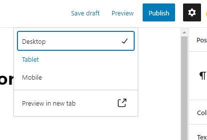
 The WordPress block editor allows us, the editors, to resize the view by accessing the “Preview” options from the top-right toolbar.

That’s a cool option that lets us know how the content will look on different devices.
But what happens if we want to do this programmatically? What if we want to switch between different devices using the code only? There are many reasons why you’ll want to do this. Which are not the reason to discuss them here.
Easy-peasy, let’s get to work and show some code. But before we start, I must note that the code differs between the post editor and the site editor.
- Post Editor — the editor that we use when we edit the content of posts, pages, and other CPTs.
- Site Editor — the editor that we use when editing the site layout.
Resize the post editor programmaticaly
This will resize the post editor to Tablet mode:
wp.data.dispatch('core/edit-post').__experimentalSetPreviewDeviceType('Tablet');If you want to access the current mode value use this code:
wp.data.select('core/edit-post').__experimentalGetPreviewDeviceType();It will return Tablet
Resize the site editor programmaticaly
This will resize the site editor to Tablet mode:
wp.data.dispatch('core/edit-site').__experimentalSetPreviewDeviceType('Tablet');If you want to access the current mode value use this code:
wp.data.select('core/edit-site').__experimentalGetPreviewDeviceType();It will return Tablet
Quick tip:
You can run these lines of code in the Developer console and the results will show up instantly.
Happy coding! 🙂
Comments
Share your thoughts and join the conversation
No comments yet
Be the first to share your thoughts!
Failed to load comments
Please try refreshing the page
Leave a Comment